Monday, 21 January 2013

'Rave' (my music magazine)


DOUBLE PAGE SPREAD - Final Design

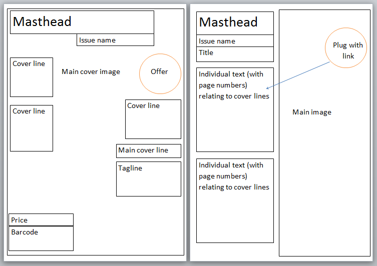
This is my final design for my double page spread.

Left/ I slightly altered the magazine's logo size to fit into the blank space and not overlap the model. I also took out the sub heading of the magazine's issue name as I did not feel it was needed constantly throughout the magazine, only on the front cover and contents page.
Right/ I decided to change the layout of this page to create a more organised appearance. I moved the title and placed it in its own right. I also used a drop capital for the start of my introduction to give it a more professional look as this is often included in magazine articles. Furthermore, I again split my columns into three following extensive research on magazine articles, which made my previous design's wording look too stretched and in need of being made more concise. In addition, I decided to make the first interviewer and interviewee in the question and answer part more clear by writing their full names. After this, I kept the abbreviated versions. I also gave the individuals different colours to make it more obvious which was which. I decided to change the featured images to the original unedited photos I took as I felt the effects made the page seem too busy and I wanted to strip it back to focus on the interview itself. Finally, I spaced the promotional caption out more as it seemed far too squashed in.

DOUBLE PAGE SPREAD - Page 2 (Designs 1 & 2)
These are my first and second designs for the second page of my double page spread. 
1/ I created the background from drawing a box and adding a colour relating to the first page of my double page spread. I then used the gradient tool so that the page did not look too basic and unprofessional. I decided to write a Q&A type article relating to my front cover main headline and fictional artist model. I made sure to include certain points mentioned in the description on my contents page and front cover headline. To make it clear to the reader which was the question and answer parts, I included the initials of Rave as R and the artist (Connor T) as CT. I incorporated a brief introduction at the top of the page to introduce what the interview would be about. I included a pull out quote from the interview with speech marks to make my title as I thought it would be eye-catching to the audience as it is a controversial topic, hence the emphasis in font colour for the word 'drugs'. I also used the images I took of the artist being interviewed to illustrate the text. Finally, I added a caption for the bottom photograph to promote the artist's song.
2/ For my second design, I thought that the text did not look correct for a magazine article and decided to place it into two columns to make it easier for the reader to follow. I also included an iTunes symbol in the caption as it is a well known symbol associated with downloading.


DOUBLE PAGE SPREAD - Page 1 (Design 1)
This is my first design for the left part of my double page spread. I decided to use this image as it used a lot of the space on the page up, which I thought was suitable as I only wanted to include an image on the page with the magazine's logo, including an article on the right side. I cropped the image to give a 50/50 appearance of the model and relating the second page to the model. I also edited the image to make it more eye-catching and vibrant as the original was fairly bland and washed out. I boosted the contrast and added effects to relate to the genre of my magazine to appear as lasers in a night club.


CONTENTS PAGE - Final Design
This is my final design for my contents page. I decided to take another image as I realised I needed to include four images taken by myself throughout the three elements. I decided to make my model wear headphones to relate to a promotion featured on my front cover associated with Beats headphones. It also continues the theme of DJ's in association with the theme of my magazine which was also used on the front cover model. I cropped this image and rotated it vertically as I thought the model's direction was better placed facing from the right. I also processed the image into black and white to keep the page fairly simple and undistracting from the focal point I wanted being the text. Next to the model, I added an extra page number feature to link the reader to the related text in the left text column. I liked that my previous design had an effect on the image that columnised the page fit for the text to be placed, so I created a semi-transparent box in which to place the text. I kept the section of 'cover picks' to relate to features included on the front cover, but created a new section (own-zone) to include entertainment-related pages. The main cover story was placed in a separate colour to make it eye-catching and clear to the reader that this is the main story that they should read. I have made more efficient use of the space on the page by stretching the text out to fill blank space.


CONTENTS PAGE - Design 1
This is my first unfinished design for the contents page of my magazine. I included the magazine's logo and sub heading from my front cover design to give it a continued theme and professional appearance following my research on mixmag's contents page which also featured the magazine and issue name. I have also used the inspiration from my research to create my criteria and page number appearance in a similar alignment. I have used my own taken image which relates to the front cover model, giving a continued theme. 


FRONT COVER - Final Design

This is my final front cover design for my magazine. I have added a price for my magazine as I found this to be the industry standard when researching. I have moved the main cover story to make way for more minor stories in the magazine. I have changed the main cover story headline to suit my model on the cover and make an original story/artist. I have used basic black colour for most of the font and instead used the outline to emphasise the bright colours and make it stand out from the hectic, bright background. For example, instead of using the V Festival logo, I incorporated the logo's colours. I have edited the offer to make it more bright and eye-catching and taken off the model's face. I included the Beats Audio logo for the audience to recognise and attract. I have fixed the sub heading of the magazine's name THE SUMMER ISSUE to tie in with the logo and make the issue name clear. It also takes the place of needing to include the magazine's date of issue.


FRONT COVER - Design 1

This is my first unfinished design for the front cover of my magazine. As described in my initial plan, I have named the magazine RAVE and included a logo which I think reflects the uncontrolled and spontaneity of the event, with the font being messy and random. I decided to use the main image as it has a lot of free space around the model that will be useful for placing cover lines, plugs, promotions, and general subtext on. I originally intended to capture the model laying on a background of grass, but the heavy snowfall made this unachievable. Instead, I found a technique on Photoshop  that allowed me to add blades of grass which I liked the effect of. After this, I decided to create paint-like splodges over the time as I also wanted to achieve this in the original photo but couldn't. I chose vibrant colours to draw into the model's accessories and also stand out against the green shades of grass. Furthermore, I incorporated a barcode to make the magazine appear more realistic. I included an offer to entice the audience into buying the magazine for a free product.


ORIGINAL CAPTURED IMAGES

I took these images as the main idea for my model for my music magazine. As it is a dance genre themed magazine, I decided to incorporate related ideologies following my research. These included the headphones and bright fluorescent colours. I thought the images were successful but slightly bland and dull on their own and I wanted to make them more eye-catching. For this, I used an online photo editing programme to make the photos more vibrant by adding effects and adjusting the contrast.

Monday, 14 January 2013

My music magazine plan


Initial ideas:
  • Main image: Model covered in paint
  • Target audience: 18-30 year olds (mature teenagers to young adults)
  • Magazine music genre: Dance
  • Included information: Concerts and festival dates, new artists, charts, interviews

I am planning to do a dance music genre magazine. The target audience of this genre type could be DJ's and teenagers to young adults who socialise at bars, clubs and raves.


I have looked at mixmag magazine for research as it is a dance and club related music magazine which is what I plan to base mine on. I notice that mixmag's magazines use extremely bright colours that are eye-catching. I intend my model to be lying on the ground wearing sunglasses, headphones and holding a large boombox. He will wear jeans and a neon coloured t shirt. After the photo is taken I will edit it to include bright neon coloured lights and paint splodge effects to give the idea of a rave.

The typical content of my monthly magazine will include festival, concert dates, new and upcoming DJ's, dance charts and interviews with dance artists. I plan to call my magazine RAVE as it reflects the style of music played at these events, relating to the genre of my magazine.

I will use a simple Sans Serif text font for the title of the magazine. For the cover story title I will use a crazy artistic font to connect with the messiness of the cover image.

The contents page of mixmag incorporates the magazine's name and also has an issue date. I plan to implement these features into my contents page design as I think it gives a continued running theme that links the pages together. The page features headings and page numbers to guide the reader throughout the magazine. I like the alignment of this as it is clear and easy to read as each different subheading is spaced out and in its own right.

Flat plan:

Page 1 refers to front cover, page 2 refers to contents page, page 3 refers to double page spread

Thursday, 27 December 2012

Research on dance music magazines: double page spreads


NME magazine double page spread:

NME is an indie/rock/alternative music magazine published in the United Kingdom. The double page spread has been organised fairly neatly and in a structured manner, juxtaposing the idea of the indie and alternative genre as being messy, disorganised and different. However, the main image used on the left half of the spread features a band that wear dark, alternative clothing in a room with unarranged images behind, apposing the page's layout. The magazine's audience is explicitly for older teenagers and beyond - notably males - as it features half-naked women, and also sexual language such as "filthy" and is also noted in the band's quote: "Of course we're a sexual band." In addition, the band's title alone hints at the target audience.


Q magazine double page spread:

Q magazine is an pop music magazine published in the United Kingdom. The double page spread is very minimalistic and makes use of the space of the two pages. The main image relating to the music star Drake shows the artist wearing a gold chain which represents wealth and power. The text used "hottest talent" suggests the magazine is using the artist to attract a predominantly female audience and also male audience who could aspire to be like the star. To the top right of the second page, text in a square shape reads "New to Q"; these words all rhyme to give the reader a way to remember the feature. This object is approximately the same height as the story's small block text, making it seem that the editors think as highly of their name as they do of their interviews.

Monday, 12 November 2012

'The Handbook' (my college magazine)


FRONT COVER - Final Design

 For the third design of the contents page, I researched into the contents pages of other magazines to get a better idea of the appearance. I decided to add a brief explanation underneath the page titles to give more detail and information on what each page includes. I also added the title "Contents" to make it much clearer on what the page actually is, and noted the issue date. I split up the page numbers into different boxed sections to make the text more easily interpreted. I think this version is much more successful than my previous efforts as it is easier to the eye to look at and looks much more organised and professional. Furthermore, I removed the pictures previously inserted that were copyrighted and left boxes to add in my own taken photographs later. I also think the white background works better than the cream as the company logos look more streamlined and professional without white space appearing on a separate colour.


CONTENTS PAGE - Design 2

For my second design of the contents page, I decided that the previous design looked messy and unorganised. I aligned the page numbers to give a neater appearance and this also made there seem like more writing, making more efficient use of the blank space. I also included more images found from the internet to fill blank space and brighten the page up to make the page more enticing.  

CONTENTS PAGE - Design 1

This is my first design for the contents page of my college magazine. I drew influence from the front cover with the background colour being similar. I wanted the magazine to look the same throughout to create professionalism. I also used the same fonts and colours. I included the title of the magazine at the top of the page and referred to my front cover's cover lines for inclusion in the page number information. Furthermore, I used found images from the internet to illustrate the pages and make it more visually exciting. I included company logos relating to the college as sponsers.

FRONT COVER - Final Design

This is my final front cover design for my college magazine. I have added a masthead at the top of the page as the title of the magazine. I chose the name as I think it relates well to education but is not too formal to put students off picking an issue up. I kept the colours and fonts fairly limited to create a consistent design feel. For most of the cover lines included, I have used a capitlised verbs such as "experience" and "learn" as I think it attracts the audience to make them want to do these activities. I have also used punctuation such as exclamation marks to create a signifcant effect and make it clear to the reader that the selected points are exciting and/or important. For example, I used the plug 'FREE!' in a bold autoshape to lure the audience into picking a copy up. I used a banner across the page, towards the bottom as I thought this appeared professional and added variety to the page instead of everything being aligned at a specific horizontal angle. I also added my college's logo to make it clear that the magazine is specifically made for the college only, adding a personal touch that students can relate to instead of a generic education publication. Finally, I have added an issue date to signify when the magazine applies to which is beneficial with inside information such as offers that may only be valid for a certain period.


CHOSEN FRONT COVER

This is the image I took in college for use as the model of my front cover. I cropped the image to centre the model. I like that the background is basic and undistracting from the main foreground. I used Adobe Photoshop to add high contrast and brightness in the image to create vibrancy and again, pull the model from the background and attract the audience. I like the image as it stands out and looks as though it would be good for a magazine cover as it has space at the very top for a title. Also, the eyes are located inline with the top third if taking into account there was a rule of thirds grid over the image. The head is in the centre third and the two arms fit well in the left and right thirds.

Monday, 5 November 2012

College magazine plan

Initial ideas: 

Main image: Student relating to college having fun
Target audience: Students aged around 16-18
About: The college, services around the college, competitions, games, prices, food

Monday, 22 October 2012

IPC Media

IPC Media (formerly known as International Publishing Corporation) is a consumer magazine and digital publisher in the United Kingdom, founded in 1958. The company is considered a very successful organisation, selling over 350 million copies each year. IPC owns over 60 media brands, creating content in print, online, mobile, tablets and events. Its audience - over 26 million UK adults - is made up of two thirds of women and over 40% of men in the country. 


Above is a wide selection of brands that IPC Media own, including genres of music, leisure, fitness, style, cooking, lifestyle and animals. To me, this shows that IPC is an extremely successful company that is intelligent enough to invest in many different styles of magazines. In addition, it shows that they have many different editors for each magazine that must know what they are talking about. 
This is proven with its own quote from its website:

"IPC Media is committed to working in partnership with its consumers, advertisers, business partners and employees to deliver exceptional value, service, innovation and creativity."
Numerous magazines have recently celebrated "birthdays" after impressive periods of longetivity. In October 2012, magazine, 'Woman's Own' celebrated its 80th birthday since being launched in 1932.  Woman’s Own has proved to be highly successful, connecting with its target audience of the more mature woman, with stars including Margaret Thatcher and Madonna appearing as cover stars. To celebrate the birthday, the first edition of Woman’s Own was made available as a digital magazine. 


Woman's Own publishing director, Roger Cummings, spoke of the magazine's journey saying, "The brand has re-launched the magazine, developed a standalone website and launched an optimised mobile site. And now it celebrates its 80th birthday. To toast its heritage in such a modern, forward-thinking way, the birthday issue and digital extensions epitomise everything that the loyal, Woman’s Own audience stand for. They are passionate about getting the best out of life, love to celebrate and most importantly, know how to have fun with friends and family”.
IPC Media would be an appropriate publisher for a new magazine as the company specializes in a variety of different genres across their magazines that remain current in the time period. Therefore, creating a new music magazine would not be a particularly difficult task. In addition to this point, they could easily create any genre of music magazine they could find experts for. 


Monday, 15 October 2012

Representations in teen girl magazines

These magazines are all aimed primarily at young teenage girls. They portray this targeted audience in many ways displayed on the front covers of their publications. One way in which they intend to lube these girls up into buying their magazine is by using feminine and girly colors. As apposed to magazines for the more mature lady, magazines for young girls use much brighter and eye-catching tones, mainly the bold "bubblegum" pink. Each of these covers use a recurring main image: a young, attractive and current female celebrity in the public eye. They do this to attempt the reader to aspire to be like these celebrities, tempting them to buy the magazine as they 'i love boys' think that if they do, they will find out secrets to make them look like these attractive women. Also present on all five of these covers are images of clothes and captions about style and fashion. These clothes, like the colors used on the magazines, are bright and girly and are linked well with the target audience. On most of these covers, a price is usually associated with the clothes that uses words to make these seem good value such as "only" and "under". These words also connect with the target audience as it is thought that girls are always looking for good deals or a bargain.

These magazines may have a negative effect on its readers as there is no real message to them about being comfortable with themselves as they are. This is displayed by using "made-up" women with lots of make-up and perfect bodies that younger girls do not yet have necessarily. There are no images present of natural women that are referred to as "real" or that are slightly bigger-looking in size. This can further lead to its readers developing eating disorders such as anorexia and bulimia. Another negative effect of thse types of magazines is that many of the stories inside are purely fictional and rumours, encouraging its readers that this information is fact. To its young readers, it tells them that it is okay to twist the truth and also believe everything they read in the media. Furtheremore, it introduces stories of unfaithfullness in relationships, sexual ways of dressing/revealing outfits that young girls may want to copy. This is a problem as young girls should know how to mature steadily and not before they have grown into their bodies correctly.


On the other hand, these magazines can also have a positive effect for its readers. If girls see clothes that they like that they then go out and find themselves, they will feel good about themselves and feel like a celebrity. It will result in its audience having more confidence, which is considered important in the present day as many girls in the target audience's age range are bullied and feel body-concious. Another point to make is that girls like discovering secrets of celebrity's looks, and will feel happy if - in their mind - they can emulate these. Also, the magazine as a whole is good entertainment for girls as they like to read about popular celebrity gossip stories that everyone is talking about. In addition, it is a good social benefit that gives its readers something to discuss with eachother around their friends.


I believe that magazine publishers should accept responsibility for the effects that their magazines have on its audience of teenage girls. I think this because they are an extremely powerful group of people who are well aware of what is needed in order for these girls to buy these magazines. If they are presenting ever magazine cover with a "perfect" looking celebrity, they are making girls feel that they need to be perfect and look like these celebrities who are most likely airbrushed and edited in the images used. Stories in the media are constantly arising of the issue of eating disorders that girls take on from feeling that they are too fat and not like celebrities seen in these magazines. Therefore, the publishers of these magazines should be held responsible for not using "real" women that will makes girls feel much better about themselves. Also, if these magazines give advice on topics such as how to deal with relationships, girls will most definitely use this in their lives as they believe in magazines. 

If I became an editor of one of these magazines, I would most definitely use more "real" looking female celebrities that its readers could relate to as I believe it is extremely unhealthy and wrong using perfect images of these women. I would make sure that everything written is encouraging to girls. I would not put any stories into the magazine that highlighted rumors that led to nowhere, for example: celebrity cheating, appearance enhancing such as boob jobs and face-lifts, as this just encourages its readers to make up rumors themselves and again not feel happy with themselves as they naturally are. I would keep the style part of the magazine in as there is no negative effects of this. I would make sure the clothes were affordable to its target audience. I would not include any headlines or stories of how to lose weight or get a better body in any way, as this just gives the impression that people who would read the magazine are only girls who are unhappy with the way they look, and that would not be my idea of a magazine purpose.

Monday, 8 October 2012

Magazine Cover Analysis 2


The target audience for Soaplife magazine is generally "Women aged 15-34 who watch multiple soaps". The cover appeals to this niche as women like drama and the text and images used show this very deeply. Every separate story on the page is linked with text that concludes with an exclamation mark that creates this tension and drama that attracts women. The cover illustrates various text colors and sizes that break the page up and make it more interesting. The page is very bright and colorful that is usually associated with femininity. Throughout the page, in each picture a male and female is shown in a type of relationship, mostly sexual, traditionally appealing to women as they are expected to like reading about relationships and gossip magazines.  Two images also show this of couples kissing which presents sexuality, again attracting women's eyes. Phrases such as "Love", "Marry Me!", "New Lover" and "It's ON again!" can all be connected to femininity in some way, all  sexually related. The most eye-catching word is "Love" as it is the biggest and is put in red in the centre of the page, which is the first thing the eye is drawn into. The cover appears highly un-organized and messy-looking, showing there is a lot going on, appealing to its target audience of multiple soap-watchers. "2 weeks revealed" is used well as readers want to be informed about stories in soaps and are re-assured to buy the magazine when these stories are said to be revealed inside. The price is also connected to its audience's age-range of 15-34 year olds, as older women are expected to have earned more money and subscribe to higher-priced, more professional magazines, whereas younger women usually buy cheap magazines as they are thought to not have as much money in their lives as they grow up, struggling with jobs, loans, university fees and socializing/shopping.