DOUBLE PAGE SPREAD - Final Design
This is my final design for my double page spread.
Left/ I slightly altered the magazine's logo size to fit into the blank space and not overlap the model. I also took out the sub heading of the magazine's issue name as I did not feel it was needed constantly throughout the magazine, only on the front cover and contents page.
Right/ I decided to change the layout of this page to create a more organised appearance. I moved the title and placed it in its own right. I also used a drop capital for the start of my introduction to give it a more professional look as this is often included in magazine articles. Furthermore, I again split my columns into three following extensive research on magazine articles, which made my previous design's wording look too stretched and in need of being made more concise. In addition, I decided to make the first interviewer and interviewee in the question and answer part more clear by writing their full names. After this, I kept the abbreviated versions. I also gave the individuals different colours to make it more obvious which was which. I decided to change the featured images to the original unedited photos I took as I felt the effects made the page seem too busy and I wanted to strip it back to focus on the interview itself. Finally, I spaced the promotional caption out more as it seemed far too squashed in.


DOUBLE PAGE SPREAD - Page 2 (Designs 1 & 2)
These are my first and second designs for the second page of my double page spread.
1/ I created the background from drawing a box and adding a colour relating to the first page of my double page spread. I then used the gradient tool so that the page did not look too basic and unprofessional. I decided to write a Q&A type article relating to my front cover main headline and fictional artist model. I made sure to include certain points mentioned in the description on my contents page and front cover headline. To make it clear to the reader which was the question and answer parts, I included the initials of Rave as R and the artist (Connor T) as CT. I incorporated a brief introduction at the top of the page to introduce what the interview would be about. I included a pull out quote from the interview with speech marks to make my title as I thought it would be eye-catching to the audience as it is a controversial topic, hence the emphasis in font colour for the word 'drugs'. I also used the images I took of the artist being interviewed to illustrate the text. Finally, I added a caption for the bottom photograph to promote the artist's song.
2/ For my second design, I thought that the text did not look correct for a magazine article and decided to place it into two columns to make it easier for the reader to follow. I also included an iTunes symbol in the caption as it is a well known symbol associated with downloading.
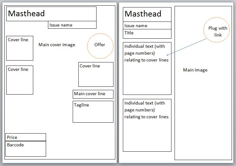
DOUBLE PAGE SPREAD - Page 1 (Design 1)
This is my first design for the left part of my double page spread. I decided to use this image as it used a lot of the space on the page up, which I thought was suitable as I only wanted to include an image on the page with the magazine's logo, including an article on the right side. I cropped the image to give a 50/50 appearance of the model and relating the second page to the model. I also edited the image to make it more eye-catching and vibrant as the original was fairly bland and washed out. I boosted the contrast and added effects to relate to the genre of my magazine to appear as lasers in a night club.
CONTENTS PAGE - Final Design
This is my final design for my contents page. I decided to take another image as I realised I needed to include four images taken by myself throughout the three elements. I decided to make my model wear headphones to relate to a promotion featured on my front cover associated with Beats headphones. It also continues the theme of DJ's in association with the theme of my magazine which was also used on the front cover model. I cropped this image and rotated it vertically as I thought the model's direction was better placed facing from the right. I also processed the image into black and white to keep the page fairly simple and undistracting from the focal point I wanted being the text. Next to the model, I added an extra page number feature to link the reader to the related text in the left text column. I liked that my previous design had an effect on the image that columnised the page fit for the text to be placed, so I created a semi-transparent box in which to place the text. I kept the section of 'cover picks' to relate to features included on the front cover, but created a new section (own-zone) to include entertainment-related pages. The main cover story was placed in a separate colour to make it eye-catching and clear to the reader that this is the main story that they should read. I have made more efficient use of the space on the page by stretching the text out to fill blank space.

CONTENTS PAGE - Design 1
This is my first unfinished design for the contents page of my magazine. I included the magazine's logo and sub heading from my front cover design to give it a continued theme and professional appearance following my research on mixmag's contents page which also featured the magazine and issue name. I have also used the inspiration from my research to create my criteria and page number appearance in a similar alignment. I have used my own taken image which relates to the front cover model, giving a continued theme.

FRONT COVER - Final Design
This is my final front cover design for my magazine. I have added a price for my magazine as I found this to be the industry standard when researching. I have moved the main cover story to make way for more minor stories in the magazine. I have changed the main cover story headline to suit my model on the cover and make an original story/artist. I have used basic black colour for most of the font and instead used the outline to emphasise the bright colours and make it stand out from the hectic, bright background. For example, instead of using the V Festival logo, I incorporated the logo's colours. I have edited the offer to make it more bright and eye-catching and taken off the model's face. I included the Beats Audio logo for the audience to recognise and attract. I have fixed the sub heading of the magazine's name THE SUMMER ISSUE to tie in with the logo and make the issue name clear. It also takes the place of needing to include the magazine's date of issue.

FRONT COVER - Design 1
This is my first unfinished design for the front cover of my magazine. As described in my initial plan, I have named the magazine RAVE and included a logo which I think reflects the uncontrolled and spontaneity of the event, with the font being messy and random. I decided to use the main image as it has a lot of free space around the model that will be useful for placing cover lines, plugs, promotions, and general subtext on. I originally intended to capture the model laying on a background of grass, but the heavy snowfall made this unachievable. Instead, I found a technique on Photoshop that allowed me to add blades of grass which I liked the effect of. After this, I decided to create paint-like splodges over the time as I also wanted to achieve this in the original photo but couldn't. I chose vibrant colours to draw into the model's accessories and also stand out against the green shades of grass. Furthermore, I incorporated a barcode to make the magazine appear more realistic. I included an offer to entice the audience into buying the magazine for a free product.
ORIGINAL CAPTURED IMAGES
I took these images as the main idea for my model for my music magazine. As it is a dance genre themed magazine, I decided to incorporate related ideologies following my research. These included the headphones and bright fluorescent colours. I thought the images were successful but slightly bland and dull on their own and I wanted to make them more eye-catching. For this, I used an online photo editing programme to make the photos more vibrant by adding effects and adjusting the contrast.


 Question 6: http://mind42.com/mindmap/b3a065c2-ee8b-42fb-a847-04e1cc408fbd?rel=url